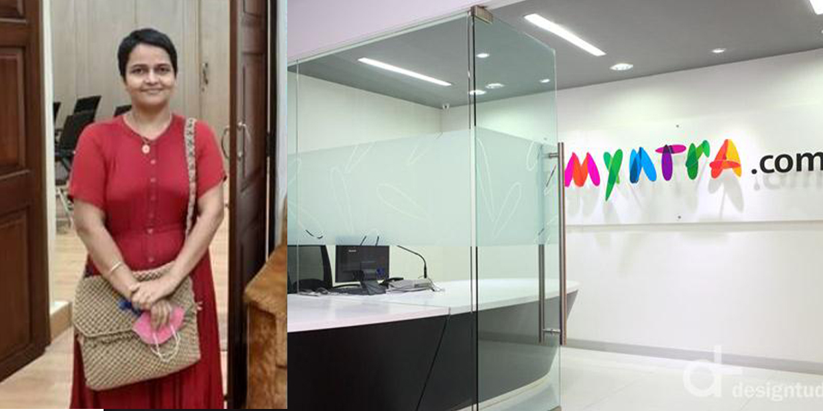
Myntra is a medium where you can easily get everything from clothes, home décor to everyday kitchen essentials of your choice. Myntra has a reputation for service, quality, and delivery of goods. The first thing that comes to mind when you think of buying clothes at home is Myntra. This time the finger was raised against the company, not for buying services or accessories! The finger is pointed at the Myntra for its logo. A few months ago, a woman named Naz Patel lodged a complaint with a Mumbai cyber cell, claiming that Myntra’s logo was offensive. She alleged that the logo was offensive and obscene to women.
On what basis did she complain?
When questioned, the woman said that when she saw the word ‘M’ in Myntra, it looked as if a woman was sitting with her legs folded in an ugly way. Which indicates obscenity. Although no one has thought of this before. The DCP of the Mumbai Cyber Crime Department agreed with Naz. And then, the whole allegation was reported to Myntra by mail. This type of complaint also focuses on logo design and they were surprised at first to find out after so long. Although Myntra authorities immediately replied to the mail. And let them know that they will change this logo soon.
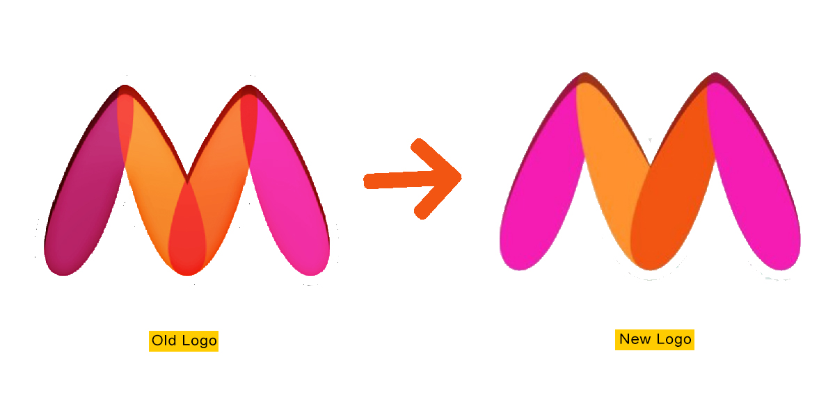
After the whole matter came to the fore, a tumultuous practice started on social media. Although many people later agreed with Naz by sharing this logo. But many say it’s an exaggeration. Because it’s nothing more than design. If really seen, there are many such words that get another dimension in the design. But the question remains as to how it indicates obscenity!
Also read – https://ohkolkata.com/the-social-media-is-flooded-with-memes-but-do-you-know-the-reason-behind-it/